Choose CMYK or spot colour for the right reason
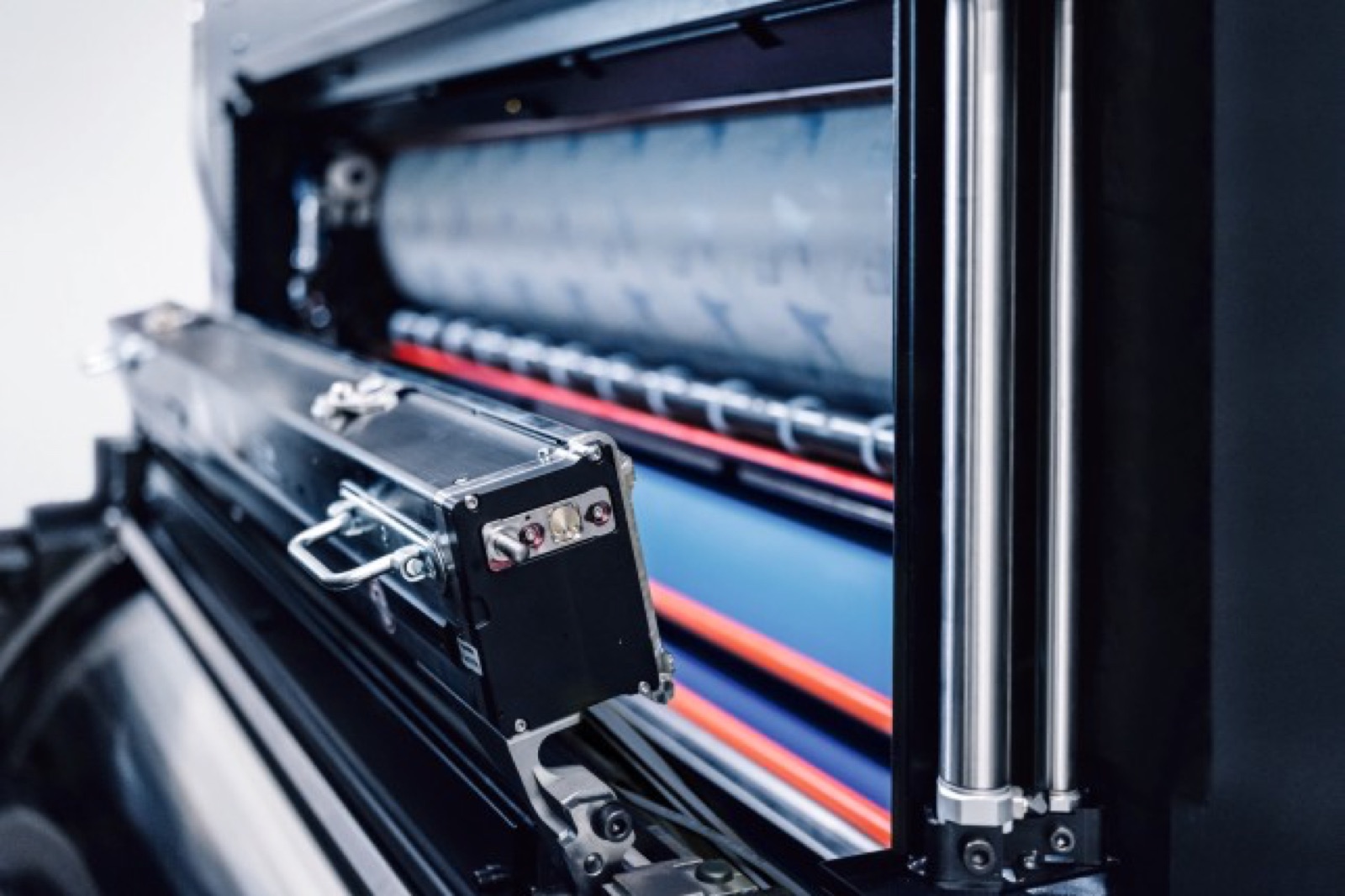
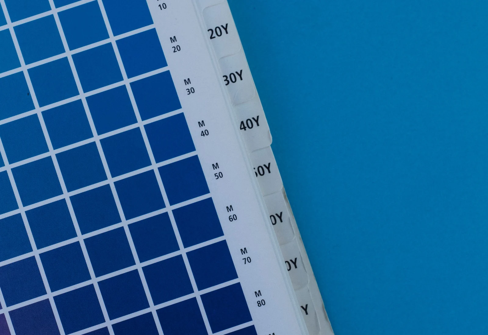
CMYK creates images and a wide range of tones by overprinting four process inks. It is efficient for photographs, gradients and multi-colour artwork, but a converted brand colour can shift with paper, ink density, screening and press condition. A monitor preview cannot predict the final paper appearance on its own.
A spot colour uses a separately prepared ink intended to match a named or physical target. It can improve control for a critical logo or a colour outside the practical CMYK gamut, but it adds a press unit, ink preparation and cleanup. Metallic, fluorescent and opaque inks also behave differently from standard process inks.
- Use CMYK for imagery and tonal graphics
- Use spot ink for selected critical brand colours
- Identify overprint, knockout and transparency settings
- Keep all approved colour references under revision control
Approve the substrate and surface finish together
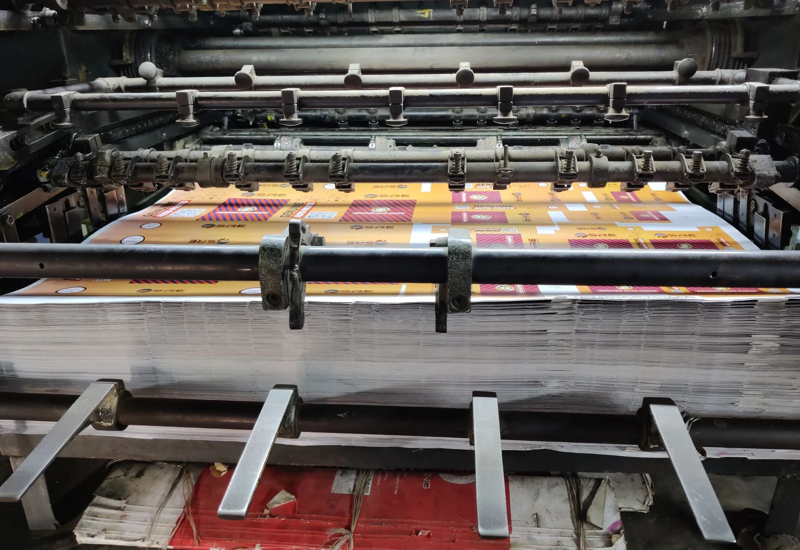
White coated paperboard, uncoated stock, kraft liner and recycled paper do not present the same colour. Paper whiteness, texture and absorbency change ink density and contrast. A colour approved on proofing paper may not visually match the same data printed on brown kraft.
Lamination and varnish change gloss, scattering and perceived depth. Matte film can soften contrast, while gloss surfaces can make colours appear denser under directional light. Approve the final decorated sample whenever the surface finish is part of the order, especially for dark solids, skin tones and closely matched product families.
- Exact paper or approved equivalent
- Paper colour, coating and surface texture
- Final varnish, matte or gloss laminate
- Decorated sample for critical visual projects

Use proofs according to what each proof can prove
A PDF proof is useful for text, content, dieline position and version control, but an uncontrolled screen is not a contract colour standard. A calibrated contract proof can predict process colour within its defined printing condition, yet it does not demonstrate folding, foil, embossing, laminate appearance or production-board behaviour.
A blank sample proves structure. A digitally printed mock-up shows layout and approximate appearance. A press proof or decorated production sample can demonstrate more of the final process but costs more and still needs an agreed inspection method. Label every approval with artwork version, date and purpose.
- PDF proof for content and placement
- Contract proof for defined process-colour prediction
- Blank sample for fit and structure
- Decorated sample for paper, finish and physical appearance
What each packaging colour approval item confirms
Select the approval object according to the risk. One proof type rarely confirms structure, colour and special finishes at the same time.
| Approval item | What it confirms | What it does not confirm | Record to keep |
|---|---|---|---|
| PDF proof | Copy, version, placement and basic separations | Final printed colour or material behaviour | Approved PDF and revision number |
| Contract proof | Process-colour prediction for a defined condition | Final board, folding and decorative effects | Proof profile, date and signed sheet |
| Blank sample | Dimensions, fit, folds, locks and assembly | Printed colour and surface finish | Dieline revision and approved blank |
| Decorated sample | Substrate, print, finish and physical appearance | Full-run variation by itself | Signed sample plus production specification |
| Press measurement | Difference from target at named locations | Overall visual judgement in every light | Values, formula, instrument condition and tolerance |
Combine visual assessment with measurement
A spectrophotometer records colour values under defined measurement conditions. Comparing the measured sample with a target produces a colour-difference value such as Delta E. The result is useful only when the instrument mode, backing, illuminant or calculation method and measurement locations are consistent.
Human review remains important because metamerism, gloss, texture, neighbouring colours and viewing geometry affect appearance. Agree the tolerance before the run and identify critical colours separately from non-critical imagery. A widely quoted small Delta E value should not be treated as an automatic acceptance rule for every ink, substrate or finish.
- Specified lighting and neutral viewing area
- Recorded measurement device and condition
- Agreed Delta E formula and job-specific tolerance
- Signed standard retained for repeat production
Reference sources
Official sources for further verification
- ISO 12647-1: Process control for the production of half-tone colour separations, proofs and prints
- ISO TC 130: Guidelines for using print production standards, January 2024
- X-Rite: Tolerancing in flexographic and offset printing
Regulations, standards and distribution requirements change. Verify the current requirements for the product and destination market before production.